From stricture to structure
14 March 2012Much has been made – quite rightly – of the developing capabilities of structural design and manufacture in rigid plastics. But is the sky really the limit now? And if not, what are the limitations on 3D innovation? Paul Gander investigates
The last decade has seen packaging designers benefit from a range of graphic and structural packages such as predictive analysis and virtual prototyping software. And, in many cases, they have also been able to tailor the software to meet their and their customers’ more specific needs.
At the same time, in the plastics arena, fresh approaches from mouldmakers and moulding equipment suppliers are allowing tighter tolerances in the production process, as well as wider shaping options and surface effects.
On-shelf, competition is fiercer than ever, not only among the brands but between brands and private label alternatives. As a result, these evolving capabilities in plastics have become tools for brand differentiation and shelf stand-out. They have also played a prime role in package weight reduction.
The boundaries set will often have little to do with the technology itself, and far more to do with cost-driven considerations for the filler, the sustainability agenda and – not least – consumer perception.
So how do these constraints work in practice? Sean Dyer, general sales manager at RPC Containers Blackburn, explains how even when a customer starts out wanting to maximise points of difference, the tug towards a common denominator can be a strong one.
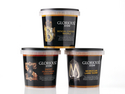
For the past decade or so, RPC has been producing the same standard range of round polypropylene (PP) tamper-evident pots for soups and sauces. But even if a food manufacturer is prepared to invest in tooling for a customised pot, the options are likely to be limited – especially if the pack is being filled on an existing line.
On the same line, the critical area of overlap is the diameter under the tamper-evident band, which is where the fit is with the guides under the filling machine,” Dyer says. “With regard to the footprint, fillers will usually want this as broad as possible for stability.”
There may be very good reasons for differentiation. RPC cites the example of a hypothetical new product from a sauce or soup manufacturer. “It’s likely to have a different price point,” says Dyer. “It may be single-serve, as opposed to the standard volume of 670ml, but the filler may want to make clear that it’s not just a small version of a larger pack.”
But again, practical considerations soon kick in. “If you want to use a self-adhesive label, the container has to be round,” he points out. “They may want to maximise structural decoration such as scalloping at the base.
But this takes up space, and you can only put a label onto a flat surface. So you may end up with a 460ml pot which has a different aspect ratio to the larger pack, but otherwise looks fairly similar.”
This urge to ensure the labelling area is as large as possible is, of course, all to do with branding. But it is further fuelled by regulatory and consumer information concerns. As a consequence, overriding it can be quite a challenge.
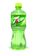
This is effectively what design and mouldmaking company R&D Leverage asked Dr Pepper Snapple group to do last year with its 7Up brand in the US. “Structurally, the bottle was very different,” reports business unit manager Christopher Yows. “But also, the label was traditionally in the middle third of the pack, and we moved it into the upper third. The label was smaller, too.”
There was a “sustainability play” in the cut-down label, but this proposed reduction in the brand’s billboard effect initially “freaked out the brand team”, according to Yows. They were finally persuaded that what the brand name may have lost in size it gained in prominence, particularly since the initial proposals were backed up by consumer research.
The fact that the packaging reduction for 7Up focused on the label rather than the bottle ties back into what is so often the primary constraint on differentiation: cost. “By staying with the same preform, the brand owner was able to contain its capital costs,” Yows explains.
Of course, within that same weight, there was plenty of scope for reshaping. “But at the same time, operationally, the bottle could move down the same line with minimal change parts.”
The most eye-catching difference will often be one which need not involve any structural alterations at all. With a change in colour, there are no mould or other capital costs, or line reconfigurations to factor in.
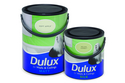
There may be questions regarding category language and consumer perceptions. But as RPC has discovered, if you can clear these hurdles, the opportunities are significant. Last year, the company’s Oakham site began production of charcoal colour PP cans for white paint under AkzoNobel’s Dulux brand in the UK – a sharp contrast inside the pack, and a clean break with the traditional white can. And for the first time in this category, Dulux is incorporating 25% post-consumer waste into the black containers.
However, there are probably more examples of where sustainability is pushing brands towards category convergence, rather than differentiation, in the visual impact of their packaging. Polyethylene terephthalate (PET) specialist APPE provides the example of Belgian-based mineral water brand Spa, which last year moved away from the distinctive red colour used on its sparkling water bottles. This was in order to make the packs more easily recyclable, as APPE’s product design manager Steve Windelinckx explains.
The prioritisation of recycling does not exclude colour altogether. “We are producing multi-colour bottles from multilayer preforms,” says Windelinckx. “So a bottle can be bluish at the base, fading to clear PET at the top.” This is likely to have a negligible impact on recycling, he adds, especially since a blue tint is quite common in mineral water bottles.
Sustainability in the form of lightweighting is also having a category convergence effect. “When you have highly carbonated soft drinks (CSDs), everything tends to reshape itself as a cylinder,” Windelinckx explains. The tendency can be overridden by the use of panels in the bottle, but then this necessitates the use of more PET in the preform. “Lightweighting does limit the shaping options available, especially for CSDs,” he concludes.
But what is ‘differentiation’? Increasingly, the answer can be – as in these examples – more to do with a sustainability message than with visible contrast. And what exactly are you differentiating your pack from? From competitors, certainly. But as in the 7Up example, there is also an implicit contrast with what came before. Few brands or categories want to be seen to stand still, and the consumer is invited to share in that evolution.
Even where a given product is widely seen as a staple – or even a loss leader – importance is attached to packaging innovation.
In the case of Nampak Plastics’ high density polyethylene (HDPE) Infini bottle for fresh milk in the UK, lightweighting (and the potential for more) is associated with a new pack shape, rather than with standardisation around an established one.
Infini is designed to replace the bottle with the now rather outdated name of New Industry Standard (NIS), which was ‘new’ 15 or 16 years ago. Inevitably, it was designed to run down the same dairy filling lines which currently handle the NIS. But then, the UK milk industry has had years of experience of doing the same with litre and mpint-measure versions of the standard bottle, where pack heights vary but the footprint remains the same.
“In the case of Infini, the height is very similar to the NIS,” says Nampak business development director James Crick. “In terms of logistics, it has to fit the current trolley system. What you don’t want to do is lose the number of bottles on a trolley,” he says.
According to Nampak, the lightweighting potential of its patented bottle derives from the changed mould geometry. “Rather than having the part-line of the bottle across the centre, it goes diagonally from corner to corner,” says Crick. “This makes it easier to blow the plastics into the corner.” That in turn makes it easier to control – and reduce – the amount required.
The majority of filling in a consolidated dairy industry such as the UK’s happens in very large volumes. So the limits on pack differentiation for suppliers of niche and specialist milk products will largely be determined by what is available in the blowmoulders’ standard ranges.
“You wouldn’t want to go with a custom mould design for just a couple of million bottles,” says Crick. “You’d need to be going further towards 10 million to make it affordable.”
That said, up to 13 different stock-keeping units (SKUs) are available, he explains. So a small-scale supplier of goats’ milk, for instance, can use one of these and then rely on the labelling to differentiate its product further.
The limits on affordable investment by plastics converters do not only relate to customised moulds. One area which RPC has looked at repeatedly is the idea of introducing PET for instant coffee.
“But in a retail jar, the surface-to-volume ratio means that moisture absorption is likely to be a problem,” says Dyer.
“Ideally, you’d need to coat the PET. We’ve done tests with small jars, but you’d need the backing of one of the bigger brands, given the level of investment required.” He estimates that this would be in the region of £1 million to install a coating system.
Naturally, those major coffee brands would also need to be convinced that consumers were happy to make the move from glass to plastics. Consumer responses are notoriously difficult to predict.
And the cost of getting them wrong – in any category – can make all of those more easily quantifiable innovation costs pale into insignificance.
APPE dual-colour preforms and bottles APPE In the case of 7Up, the packaging reduction focused on the label 7Up Nampak Plastics’ HDPE Infini bottle Nampak Dulux is incorporating 25% post-consumer waste into these black paint containers Dulux RPC tamper-evident PP pots RPC